Tooltip Component
Small popover describing the action/purpose of an icon button.
Tooltip is a hover and focus-activated popover . A tooltip describes the primary action of an interactive control. This content appears inside of an overlay when the control receives hover or focus. In desktop software tooltips are most commonly used in relation to toolbar buttons (e.g. the trashcan icon in a mail app). Web tooltips are more commonly experienced in relation to links, buttons and form controls.
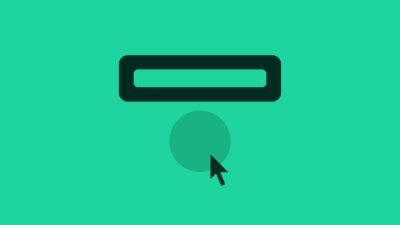
A tooltip gives additional information about an interactive element - typically a button. The tooltip activates on mouse hover or keyboard focus of the button.
The tooltip must be programmatically associated with the button by using the aria-describedby property and tooltip role.
Toggle the aria-expanded state of the button to expand or collapse its associated tooltip.
Terminology
We use the following terminology when discussing this pattern.
- tooltip : the composite pattern as a whole, containing a host and overlay
- host : the control that hosts the overlay
- overlay : the overlay that contains the tip
- tip : the content inside of the overlay