Lightbox Dialog Component
A modal, child window; renders the main window content inert.
In traditional desktop operating systems, a lightbox dialog is a child-window that typically exists to communicate information to the user, display a prompt for input, or allow the user to verify or cancel an action.
Whilst these specific cases are also valid and true on the web, we also see a wide variety of other custom uses. For example, a dialog itself might contain an entire full page-like experience, a video, image gallery, navigation or settings.
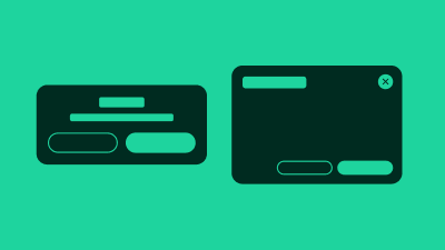
There are various ways to visually present a dialog. The version here is the "lightbox" version. A dialog that visibly dims out the rest of the page while the dialog is open.
The lightbox-dialog is fully responsive. On large screens it will be aligned to the center of the screen; on small screens at the bottom. Small screens display an additional "handle" button, used to expand the dialog height.
Terminology
We use the following terminology when discussing this pattern.
- lightbox-dialog : the pattern as a whole, comprised of the following sub parts
- parent window : the page containing the button that opens the dialog
- dialog button : the button that opens the child window
- child window : the overlay containing the dialog content
- title : the title of the child window
- modality : modal or non-modal, dialogs with a mask are always modal
- mask : CSS effect that visibly dims out the parent window content
- dismiss button : button that dismisses and hides the lightbox