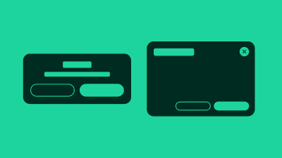
Dialog Component
A modal, child window; renders the main window content inert.
In traditional desktop operating systems, a dialog is a child-window that typically exists to communicate information to the user, display a prompt for input, or allow the user to verify or cancel an action.
Whilst these specific cases are also valid and true on the web, we also see a wide variety of other custom uses. For example, a dialog itself might contain an entire full page-like experience, a video, image gallery, navigation or settings.
There are various ways to visually present a dialog. A dialog that visibly dims out the rest of the page while the dialog is open is a modal type dialog.
The dialog is fully responsive.
Terminology
We use the following terminology when discussing this pattern.
- dialog : the pattern as a whole, comprised of the following sub parts
- parent window : the page containing the button that opens the dialog
- dialog button : the button that opens the child window
- child window : the overlay containing the dialog content
- title : the title of the child window
- modality : modal or non-modal, dialogs with a mask are always modal
- mask : CSS effect that visibly dims out the parent window content
- dismiss button : button that dismisses and hides the lightbox
HTML Dialog Attributes
Modern browsers support the native <dialog> element along with related HTML attributes such as the Invoker Commands API (e.g., commandfor, command). While these attributes provide enhanced functionality for dialog management, most are not yet widely supported across all browsers. Due to limited browser availability, we cannot rely on these newer attributes in our components at this time. We continue to use JavaScript-based approaches to ensure consistent behavior across all supported browsers.