Checkbox Component
A form control that allows multiple selections from a group of choices.
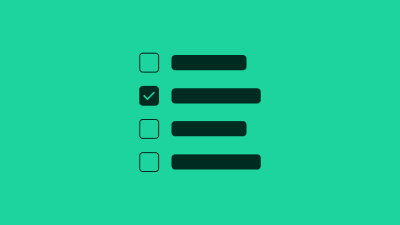
Allows selection of zero or more items in a group of options. HTML gives us native checkboxes that are fully accessible by default. Unfortunately, the look-and-feel of these controls is often at odds with a web site's design system or branding guidelines. This issue is compounded by the fact that native HTML checkboxes are traditionally very difficult to re-style with CSS. Our pattern shows how modern CSS and SVG can be used to create a custom _facade_ over the native checkboxes, while maintaining accessibility requirements.
The purpose of a checkbox is to collect form data; therefore a checkbox should always be used in conjunction with a form, label and submit button.
The checkbox is decoupled from its text label to allow more flexibility in terms of layout. How and where you provide this label is up to you, but do not forget it!