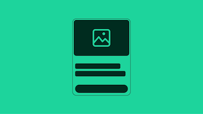
Card Component
High-level entity view with a call to action; typically part of a set.
Cards serve as containers for images, text, buttons, and other elements, making them ideal for dashboards, product listings, and content galleries. With responsive design principles at its core, the Card component reflows seamlessly across devices, providing a consistent user experience on mobile, tablet, and desktop.
Cards can be configured in multiple ways to suit different use cases. Whether you need internally-actionable cards with embedded buttons, self-actionable cards that navigate on click, or hybrid cards that combine both approaches, the Card component provides the flexibility you need.
The Card component is available in Evo Web's CSS, React, and Marko implementations, offering a reliable and standards-aligned foundation for displaying structured content across your application.
Card Types
Internally-Actionable Card
An internally-actionable card contains interactive elements like buttons or links within the card body. The card itself is not clickable, but users can interact with specific action buttons inside. This type is ideal when you want to present information with multiple action options or when the card should not navigate on its own.
Self-Actionable Card
A self-actionable card makes the entire card clickable, typically using an <a> or <button> element as the root container. This type works well for navigation to product pages, articles, or other destinations where the whole card represents a single action. Note that self-actionable cards should not contain other interactive elements within them.
Hybrid Actionable Card
The hybrid actionable card combines both approaches - the card itself is clickable, but it also displays an internal action button that performs the same function. This provides visual clarity and accessibility benefits. However, it's important that both the card and the internal button trigger the exact same action.
Layout Variants
Cards support both vertical (default) and horizontal layouts. Vertical cards are ideal for grid layouts and product listings, while horizontal cards work well for list views and feature sections. The Card component also supports different aspect ratios (1:1, 5:4, 16:9) to accommodate various content and design requirements.
Style Variants
The Card component offers multiple style options including outlined cards (with border, no background), full-hero cards (where the image spans the full width), and standard cards with backgrounds. These variants can be mixed and matched to create the visual hierarchy and emphasis your design needs.
