Evo Web
  • Components
  • Accessibility
  • Guides

Site Menu

Main Navigation
Components
Accessibility
Guides
  • Components
  • Accessibility
  • Guides
  • Github Repo
  • Accordion
  • Alert Dialog
  • Avatar
  • Badge
  • Breadcrumbs
  • Button
  • Calendar
  • Card
  • Carousel
  • Ccd
  • Chart Legend
  • Checkbox
  • Chip
  • Chips Combobox
  • Combobox
  • Confirm Dialog
  • Date Textbox
  • Details
  • Donut Chart
  • Education Notice
  • Eek
  • Field
  • File Input
  • File Preview Card Group
  • File Preview Card
  • Filter Chip
  • Filter Input
  • Flag
  • Floating Label
  • Global
  • Icon Button
  • Icon
  • Image Placeholder
  • Infotip
  • Inline Notice
  • Item Tile Group
  • Item Tile
  • Layout Grid
  • Lightbox Dialog
  • Link
  • List
  • Listbox Button
  • Listbox
  • Marketsans
  • Menu Button
  • Menu
  • Number Input
  • Page Grid
  • Page Notice
  • Pagination
  • Panel Dialog
  • Phone Input
  • Progress Bar Expressive
  • Progress Bar
  • Progress Spinner
  • Progress Stepper
  • Radio
  • Sass
  • Section Notice
  • Section Title
  • Segmented Buttons
  • Select
  • Selection Chip
  • Signal
  • Skeleton
  • Snackbar Dialog
  • Split Button
  • Star Rating Select
  • Star Rating
  • Switch
  • Table
  • Tabs
  • Textbox
  • Toast Dialog
  • Toggle Button Group
  • Toggle Button
  • Tokens
  • Tooltip
  • Tourtip
  • Typography
  • Utility
  • Accessibility Docs

  • Patterns

    • Description List
    • Fake Menu Button
    • Fake Tabs
    • Footnote
    • Form
    • Form Validation
    • Heading
    • Image
    • Input Dialog
    • Input Meter
    • Input Validation
    • Popover
    • Pulldown List
    • Region
    • Skip Navigation
    • Table Cell
    • Time
  • Anti Patterns

    • Disabling Pinch To Zoom
    • Hand Cursor On Buttons
    • Javascript Href
    • Layout Table
    • Non Interactive Hover
    • Open New Window
    • Setting Focus On Page Load
    • Tabindex Itis
    • Title Tooltip
  • Techniques

    • Active Descendant
    • Alternative Text
    • Ambiguous Label
    • Background Icon
    • Keyboard Interface
    • Keyboard Trap
    • Live Region
    • Offscreen Text
    • Roving Tabindex
    • Skip To Main Content
  • Testing

    • Checklist
    • Known Issues
  • Misc

    • Aria Essentials
    • Component Naming Scheme
    • Faq
  • Page Grid Use Guide
  • Skeleton Use Guide
  • Animation Guide

COMPONENTS

  • Accordion
  • Alert Dialog
  • Avatar
  • Badge
  • Breadcrumbs
  • Button
  • Calendar
  • Card
  • Carousel
  • Ccd
  • Chart Legend
  • Checkbox
  • Chip
  • Chips Combobox
  • Combobox
  • Confirm Dialog
  • Date Textbox
  • Details
  • Donut Chart
  • Education Notice
  • Eek
  • Field
  • File Input
  • File Preview Card Group
  • File Preview Card
  • Filter Chip
  • Filter Input
  • Flag
  • Floating Label
  • Global
  • Icon Button
  • Icon
  • Image Placeholder
  • Infotip
  • Inline Notice
  • Item Tile Group
  • Item Tile
  • Layout Grid
  • Lightbox Dialog
  • Link
  • List
  • Listbox Button
  • Listbox
  • Marketsans
  • Menu Button
  • Menu
  • Number Input
  • Page Grid
  • Page Notice
  • Pagination
  • Panel Dialog
  • Phone Input
  • Progress Bar Expressive
  • Progress Bar
  • Progress Spinner
  • Progress Stepper
  • Radio
  • Sass
  • Section Notice
  • Section Title
  • Segmented Buttons
  • Select
  • Selection Chip
  • Signal
  • Skeleton
  • Snackbar Dialog
  • Split Button
  • Star Rating Select
  • Star Rating
  • Switch
  • Table
  • Tabs
  • Textbox
  • Toast Dialog
  • Toggle Button Group
  • Toggle Button
  • Tokens
  • Tooltip
  • Tourtip
  • Typography
  • Utility

You are here

  • Evo Web
  • Components
  • Breadcrumbs
  • Overview
  • Accessibility
  • CSS 1.2
  • Marko Storybook 1.2
  • React Storybook 1.2
  • Design System

Breadcrumbs Component

A list of links representing current location in site hierarchy.
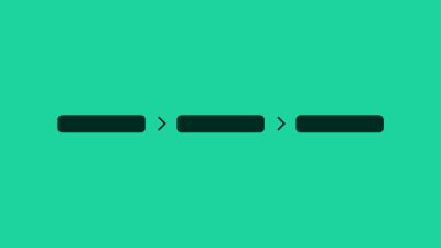
Breadcrumbs are a navigational landmark that let the user discover their current position in the site hierarchy and provide a means to navigate upwards through that hierarchy.

Breadcrumbs are typically used as secondary navigation on sites that are organized in a hierarchical manner.

Typically, the last breadcrumb is the current page, therefore that link's href attribute is not relevant and can be removed.

Terminology

We use the following terminology when discussing this pattern.

  • breadcrumbs : the pattern as a whole, comprised of the following sub-parts
  • breadcrumb item : a link
  • separator : the graphical symbol that separates each breadcrumb
Badge ComponentButton Component
Evo Web

Building accessible and performant components for the modern, responsive web. Empowering developers to create inclusive user experiences.

© 2025 Evo Web. All rights reserved.

Main

  • Components
  • Accessibility
  • Guides
  • Evo CSS Components
  • Evo Marko Components
  • Evo React Components
  • Sitemap

Web Guides and Best Practices

  • Page Grid Use Guide
  • Animation Guide
  • Skeleton Use Guide